This is an old revision of the document!
Destressing Images Design Process
Made by: Zoey
design proposal for your destressing image project and Mood Board
Empathize
In today's society, the pace of the world is fast, people have a lot of pressure about work, family, friends or study but there are not enough ways to destress. Elderly people too. They can not have the same pace as us, which makes them feel pressure. Some people can easily get digestive stress, and some people can not destress. Pressure is already a part of our lives, and we may not be able to make it go away, but we can do something we love or look at pictures for stress relief to improve it. So we want to help people reduce stress by creating images for stress relief. So we also did some research and investigation.
Define
Every people in the world have a lot of pressure, pressure is also part of your life. Pressure is not bad; some pressure can improve people, but if people have too much pressure, it will affect people's psychology and physiology. So we are doing some research about pressure and making a destressing image to help people relax. After we finish the research we will show that to the lobby of CIT, the elderly assisted living facility, and on our website. Our research tells us the color of nature like blue and green can make people feel relaxed but is not mean blue is the best choice, If we use blue in the food images people will feel disgusted. It's just like red, Red let most people feel angry and nervous but when we use it on the food image people will have an appetite. I will focus more on color because people can recognize color before shapes. The circle makes people feel relaxed, The reason why is a circle is made of soft lines, So Triangle is a bad choice because it has many angles. Also, the nature pictures like the sea, sky, and forest make people feel destressed. However, if you use the blue sky with red fire, a circle shape with a red emoji face, or Too many shapes at the same time people will not feel relaxed. Every people in the public space like MRT station or on the street, people is noisy and busy. also, the people inside the CIT very body are working so hard and they feel tired each day. In the elderly assisted living facility too, they do the same thing every day and they can not move very easily so they may feel bored. Therefore we are going to put our destressing image on the public screen, CIT and old center, to help some people to feel relaxed, that maybe is a big help for them.
Mood Board
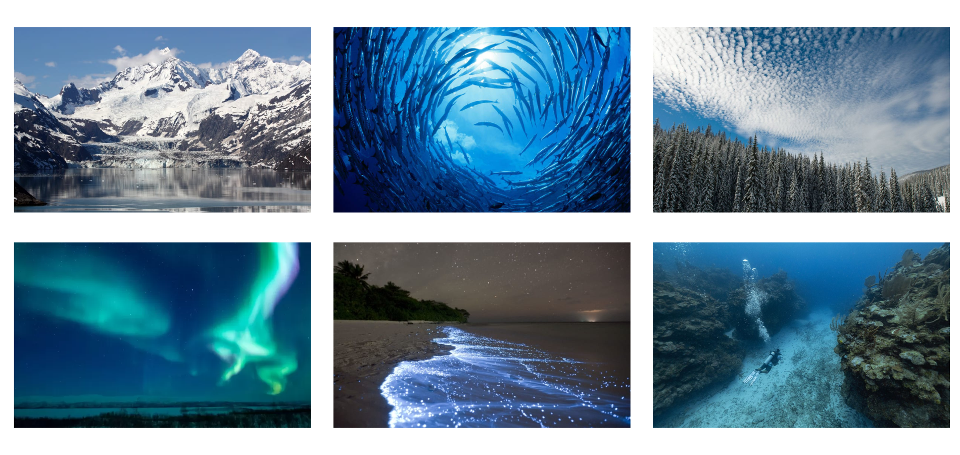
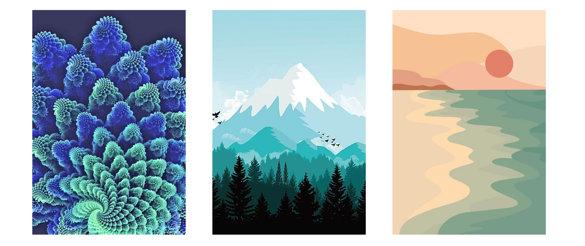
Computer art
- 15 of nature’s most awesome, must-see shows | CNN Travel. (n.d.). Retrieved 23 November 2022, from https://edition.cnn.com/travel/article/nature-must-see-shows/index.html
- Blue Streak. (n.d.). The Nature Conservancy. Retrieved 23 November 2022, from https://www.nature.org/en-us/magazine/magazine-articles/belize-blue-bonds/
- Fenomena langka di tengah pemandangan Aurora Borealis yang spektakuler. (n.d.). BBC News Indonesia. Retrieved 24 November 2022, from https://www.bbc.com/indonesia/vert-tra-61936258
Planning
Define
- What is the exact problem? How clearly can we state the problem?
- Every people in the world have a lot of pressure, pressure is also part of your life. Pressure is not bad; some pressure can improve people, but if people have too much pressure, it will affect people's psychology and physiology.
- Who are the clients?
- The worker inside the CIT
- The elderly
- Public
- Where will this be used?
- The elderly assisted living facility
- The lobby of CIT.
- What does our research tell us?
- Color: Blue and green, No red
- Shape: The shape can not be any many angles
- Playful, Humorous, and Novel can make people feel relax
- Line: Soft line, least angling
- nature, sea, and sky can make people feel relax
- What are the important tensions or conflicts?
- The blue sky with red fire
- circle shape with red emoji face
- Too many shapes at the same time
- What are the especially surprising points that arose from the empathizing exercise?
- Public space
- Too many people
- Too noisy
- Too Busy
- CIT
- Too many people talk at the same time.
- Elderly Center:
- Too open
- Too dark
- Do we have any insights into the problem?
- Because kids can recognize color before shapes so I should pay more attention to colors.
- What are the specifications of the project
- required tools
- Hydra
- SVG.js
- custom electronic circuits which use an Arduino through Johnny Five
- optional tools
- Inkscape
- GIMP
- Openshot
- Blender
- others
- functional requirements
- The image must work full-screen (full HD, 1920×1080).
- The image must be animated, meaning it changes over time. The loop must be at least 5 minutes long.
- The image must significantly react to the environment in at least one parameter that is obvious to a careful observer.
- The image must be based on your own written research report, which includes at least five citations.
sketches of your destressing images
Destressing images
Svg.js image
1. I put the tree, flower, and sunrise in the image and also I use natural colors like blue. Different kind of the blue
2. I make some fish inside the sea, I also use the natural color blue and the happy color yellow I try to make this image feel playful
3. I make many flowers and I use colorful color to make it feel playful
Hydra image
1-2. I make it look like many stars and some meteor to let people make a wish
2-2. I make it look like the sun is shining on the sea and the sea is flowing
3-2. I make it like the flower it is colorful and soft
organize feedback from classmates on destressing images, decide on direction for prototype
Yuna's feedback
I think Zoey should keep is the fish part, the hydra part was pretty good-looking with your fish. The good part of Zoey's sketches is she uses color really well. The flowers and fishes are pretty good, and look relaxed and playful. For letting people feel more relaxed, I think the part of the flowers with hydra looks a little bit heavy. If the background is too heavy, it can't let people feel relaxed. I think if Zoey can improve that part it will be better.
Yiler's feedback
I think this one is the most relaxing one among all three of the sketches. It's detailed but the main color is still outstanding.(hydra1) This one is not so relaxing compared to the other two, because it looks like there are some fast movements going on in this picture.(hydra2) I think it would be more relaxing if the pictures could have less or slower movement going on, like the first one and the second one of the Hydra sketches.
Steve’s feedback
For Zoey's sketches, I think the work she did in Hydra was really good. Her first Hydra sketch looked like putting a bunch of paint in a bowl and swirling it slightly but not mixing the colors. I also really liked the color combination. I feel like with animation it would be a lot more relaxing. However, I felt like her second Hydra sketch was not as destressing. I felt like there was too much detail and it was a little overwhelming.
Sketches 1 (fish)
- *Red word is mean the part I need to change
- *Blue word is mean the path that I can keep
SVG
- The flowers and fishes are pretty good and look relaxed and playful (Yuna)
- All the color I use is cold color so I can put some warm color inside. (Lee)
- It looks playful. (Lee)
Hydra
- The hydra part was pretty good-looking with your fishes (Yuna)
- I think this one is the most relaxing one among all three of the sketches (Yiler)
- it would be more relaxing if the pictures could have a less or slower movement going on (Yiler)
- The first Hydra sketch looked like putting a bunch of paint in a bowl and swirling it slightly but not mixing the colors, he also really liked the color combination (Steve)
- Feel like with animation it would be a lot more relaxing. (Steve)
Sketches 2 (forest)
SVG
- Make people feel cold and lonely (Lee)
- The color of the tree and the flower are good but not for destressing images. (Lee)
Hydra
- it was not as destressing, there was too much detail and it was a little overwhelming (Steve)
- This one is not so relaxing compared to the other two, because it looks like there are some fast movements going on in this picture. (Yiler)
- it would be more relaxing if the pictures could have less or slower movement going on (Yiler)
- Feel like with animation it would be a lot more relaxing. (Steve)
Sketches 3 (flower)
SVG
- The flowers and fishes are pretty good and look relaxed and playful (Yuna)
- Flower one makes people calm and stop thinking (Lee)
Hydra
- the flower part with the hydra looks a little bit heavy (Yuna)
- Feel like with animation it would be a lot more relaxing. (Steve)
Next direction for the fish sketch:
- Put some warm color inside
- Make the speed slower
- Add animation
- Give fish more space
Conclusion
Sketch 1 is the one that my classmate and I like the most, The color and the shape make people feel relaxed and playful. My next direction is to improve my Sketch 1.


